This post contains affiliate links. If you make a purchase using one of my links, I will receive a small percent of the sale at no additional cost to you.

My full vision for the cabin has been evolving and growing day by day since we officially closed at the end of September. And honestly, my brain got started on this the second I saw the listing. I’ve had so many ideas and collected so much inspiration in that time that it’s been difficult for me to edit and narrow the focus. The inspiration gathering phase is such an important design stage because out of all those beautiful images and ideas come themes – what materials, applications, colors, textures are catching your eye again and again?
What I’ve got in my head is something a bit mid-century, a bit California casual, a bit modern cottage, a bit regular modern, a bit rustic, and a bit weird. None of the images I’ve found really capture what I’m seeing in my head, which is really exciting, because I’m not out to recreate exactly what anyone else has done. I want to create something that borrows but is also, in the end, something altogether its own.
Things will inevitably continue to change (my brain keeps going and going) but I want to bring you along and show you what I’m thinking.
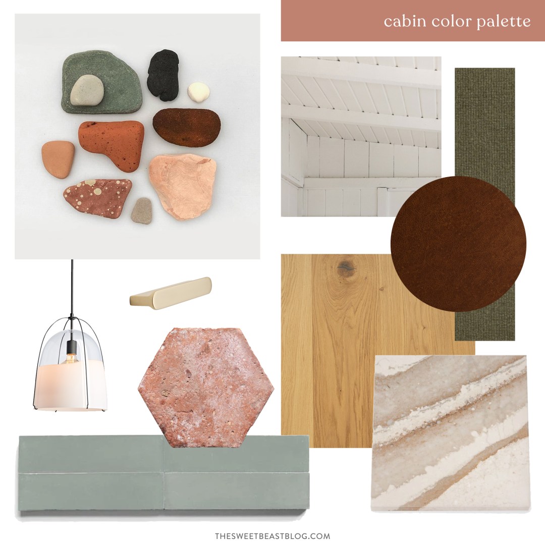
The Cabin Color Palette

[ Raystown Lake in the summer by drone | photo by Andy using my brother’s drone ]
Instead of filling our cabin with “lake” accessories or animal themes – there will be no lamps that look like fishing bears – we’re bringing the lake in with our color palette. The colors from the lake and the land around it: the green of the trees, the blue of the water, the warm wood of the forest, and the terra-cotta of the shoreline.
Raystown Lake (pictured above, our cabin is on one of the mountain ridges around it) is a wilderness lake, which means that the banks are covered in trees and nature instead of lake-front homes. I’m also here to tell you that Raystown lake is Pennsylvania’s best-kept secret. Here’s how I’m translating these colors into things that can be put into a house:

[ PresentandCorrect | Article Juniper Fabric | Article Leather | Haleigh Pendant | Bowman Drawer Pull | Antique Terracotta Tile | Basil Tile | Oak Flooring | Quartz ]
The colors: the green of the trees, the blue of the water, the warm wood of the forest, and the terra-cotta of the shoreline.
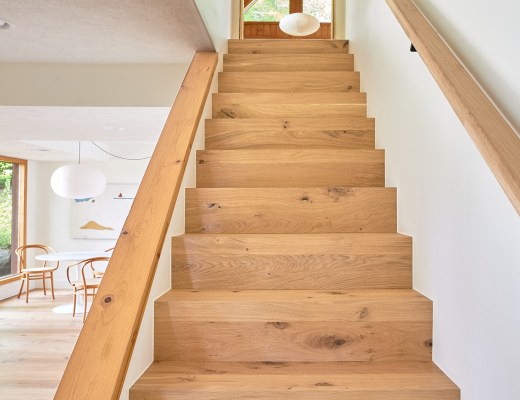
Other than the orange-y pine planked walls, trim, cabinets, and beams in the cabin, there is a lack of natural (or natural-feeling) finishes. So what do I mean by that? The vinyl flooring on the main floor had a glossy, plastic-feeling finish embossed with a stone finish atop a faux stone/slate print. The carpeting felt like it was in any house in any place in the world. The beige eggshell walls were boring and lacked interest. Our plan is to upgrade and add textures where possible. As a huge first step and major impact decision, we just replaced almost all the main floor flooring with stunning white oak floors. (Stay tuned for a whole post about how we picked and installed the new flooring.)
Cabin Interior Design Inspiration
I’m fighting the urge to make each room feel super boutique-y, and instead want to make the whole home cohesive with similar finishes, textures, and treatments. This is a benefit of tackling a home in one go, versus assembling it over time. And guess what, one way isn’t really better than the other – I’m still taking the slow decorating approach with our Pittsburgh home.
Here’s some of my inspiration:

[ Caldera House by CLB ]
What I love about this view from Caldera House in Jackson Hole is the mixing of wood tones (those floors!) and the warmth and texture in the furniture. Notes like the plaid curtains next to a modern kitchen, and chairs and sofas of different styles in varying fabrics that all work together.

[ by Colin King ]
Wood slats and texture texture texture. Plus leather and black accents.

[ 1104 Canyon Trail by Serena Mitnik-Miller and Mason St. Peter, Photography by Alex Zarour ]
Although I don’t want to paint any of the cabin’s existing orange-y pine paneling, I am very interested in installing some new paneling and painting it. Wall paneling, ceiling paneling, I’m here for it all. And all those hooks. So functional for beach towels, bathing suits, robes, and all the things.

[ Albergo Miramonti hotel by Boxx Creative via Dezeen ]
For a less rustic take, the contrast trim and matching wainscotting above create a really soothing space. The black accents (from the light fixture to the hardware to the switch plates and switches) are all modern touches that balance out the more traditional-feeling details.

[ from Mandy Moore’s guest bathroom by Sarah Sherman Samuel ]
The stacked tile that Sarah Sherman Samuel used in Mandy Moore’s bathroom is *chefs kiss* and pretty much everything I’m dreaming of. I’ve tracked it down and I believe it’s Fireclay Tile’s rosemary. I have a sample in transit as I type.
Cohesive Notes
To wrap this all up with a bow, here are the themes I’m feeling really good about for the cabin’s design direction:
- Vertical V-groove Paneling
- Lake color palette
- Just-rustic-enough warm woods
- Leather
- Tile with character
- Modern light fixtures
- Vintage and Traditional accents

[ Raystown Lake in the summer by drone | photo by Andy using my brother’s drone ]
What do you think, can you see it? Can you see our cabin all dressed up in the colors of the lake?


13 Comments
I LOVE the direction you’re going with this! It’s going to be beautiful. Those small details will definitely make the space!
P.S.
Please tell me you’re getting that Birdseye drone shot of the lake blown up and framed for the cabin. My jaw dropped, it’s so gorgeous!
Thank you so much, Tanieka! And yesss we’ll definitely be getting some of the drone photos framed for the cabin! I love them so much.
That first drone picture is gorgeous! And I love the direction you’re going, especially the colors.
Thank you! And so glad you love the colors and direction, I am so into the soothing color palette.
Loooove! Can’t wait to see this all come together. Although I may need to find my own cabin to live out my fishing bear lamp dreams. Haha (totally joking). Your design is so peaceful and relaxing!
Hahaaa thank you, Taylor!
This direction looks so cozy and relaxing but still chic and pulled together. I love it! I second Tanieka’s question about framing that first photo! So gorgeous.
Thank you! Cozy, relaxing, and pulled together are exactly all the things I’m going for. And yes, for sure we will be framing one if not both of those drone photos – we love them so much and know our guests will too.
Love love love it all! Can’t wait to see the process.
Thanks so much, Kat!
You have such good taste. I just pinned it all. I love the rust/green colors.
Awww Stacy, thank you! Rust and green 4evr.
The decor is amazing, THE COLORS! I need to find some like this that fits my cabin. I found a great faux antler chandelier to get me on the right path. https://www.casthorndesigns.com/