This post contains affiliate links. If you make a purchase using one of my links, I will receive a small percent of the sale at no additional cost to you.
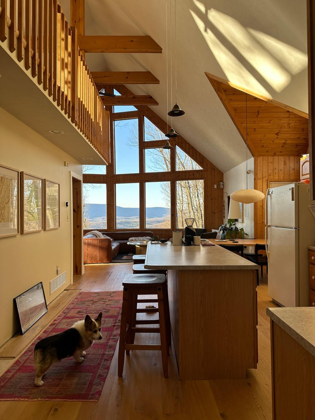
The cabin kitchen has been on my mind since I first set eyes on it in 2019. The first samples I ordered were for wood flooring, tile, and kitchen cabinet doors. I’ve been so excited to get into it that I even declared, in early 2020, that we’d take on renovating the kitchen in just 6 weeks as part of the One Room Challenge. It didn’t happen. In the three years since we put the project on hold, our vision for the cabin, and more specifically the cabin kitchen, has evolved. Three years of weekends, hosting family for holidays, standing around the island to eat snacks for lunch, and running into each other while we try to make breakfast. We’ve learned a lot and we’re finally ready to take on our modern cabin kitchen renovation.
Scope and Vision
The cabin is not our primary home and we are trying, very hard, to stick to a reasonable budget. I’m saying this to you and, mostly, to me. The plan has always been to keep the original footprint (we’ll avoid moving plumbing and major electrical) and to use IKEA cabinet boxes as two big parameters to keep the budget and scope feasible.
If we had started our kitchen renovation back in 2020, we’d have a kitchen very aesthetically different from what we’re working toward today. I had originally wanted painted cabinets in a green or beige color with large veined Cambria quartz – it would have been lovely but maybe too fussy for the woods.
With the gift of time and a lot of overthinking, I’ve re-envisioned something warmer that brings cohesion to the main floor and the home’s original elements. One of the strongest impulses people have when renovating their kitchen is making everything completely different. If they have wooden cabinets they want them to be painted, if they have dark cabinets they want something lighter. Renovating a kitchen may be the most expensive home project one ever takes on so it’s not surprising that people want things to look vastly different. For me, it’s more about following the vision for the home as a whole, while solving our biggest pain points.
Cabin Kitchen Inspiration
For the cabin kitchen, I’m interested in warmth, wood tones, natural materials and finishes, depth, and statement moments. What got me most excited about this kitchen was approaching traditional pulls and knobs in a different way. I want minimally visible, recessed J-pull hardware or I want it to be a focal point – think chunky wood handles that span the width of the cabinets. Instead of light, bright tile, I want something deep and earthy with a simple installation.
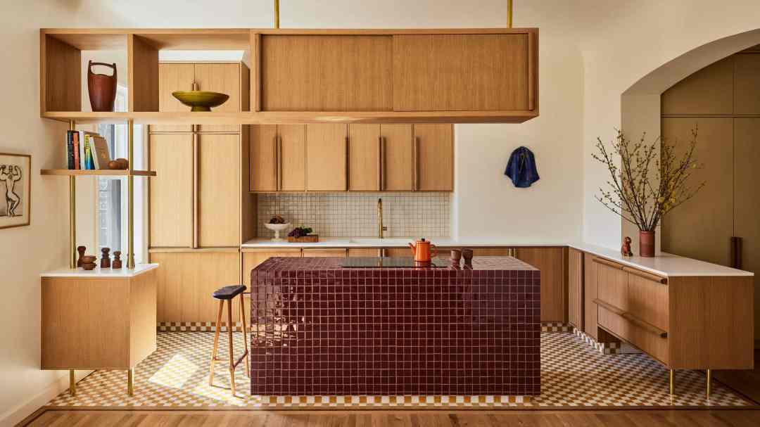
[Design by GRT Architects | via Dezeen]

[Design by Katie Lockhart and Bremworth | via The Local Project]
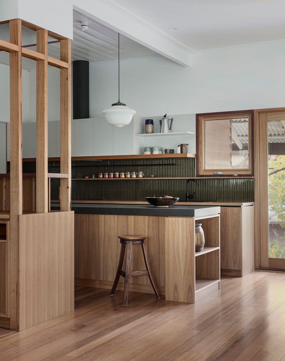
[Design by Murray Barker | via The Local Project]
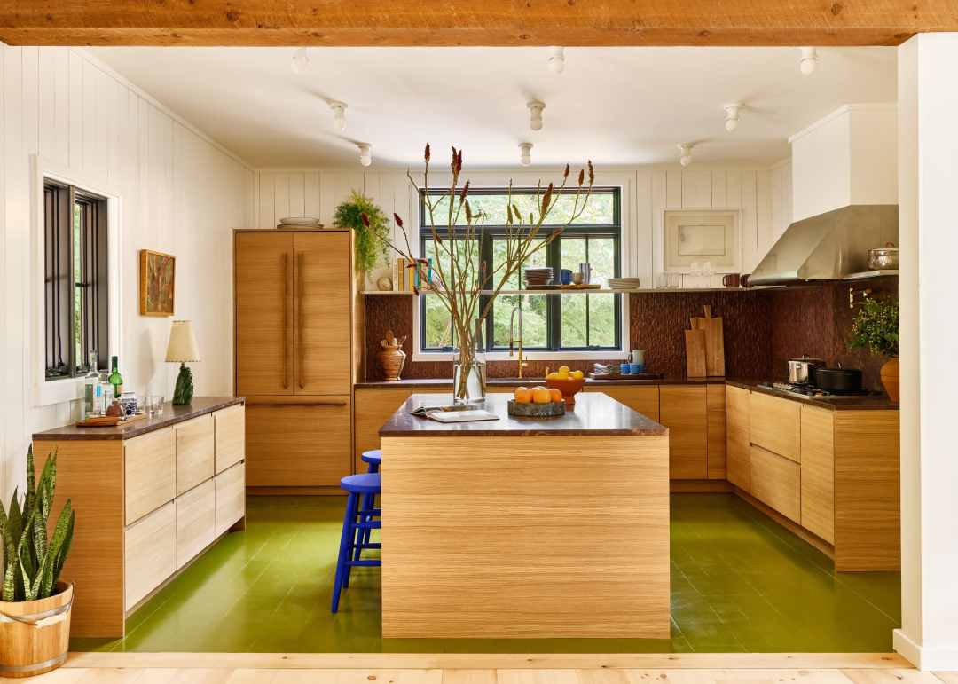
[Design by Studio Robert McKinley]
Mood Board
The mood board below is a look at how the inspiration above will be translated into materials, fixtures, and details in our cabin kitchen. A few years ago, we installed our beautiful Stuga Shell floors throughout the main floor including the kitchen. They’ll stay, of course, and create a very oak, very cabin kitchen moment. We love the look and durability (and forgiveness) of soapstone and think it will be perfect mixed with European rift sawn oak and deep, earthy tile. Subtle light fixtures and a warm-toned faucet will be soft notes that let our primary materials shine.
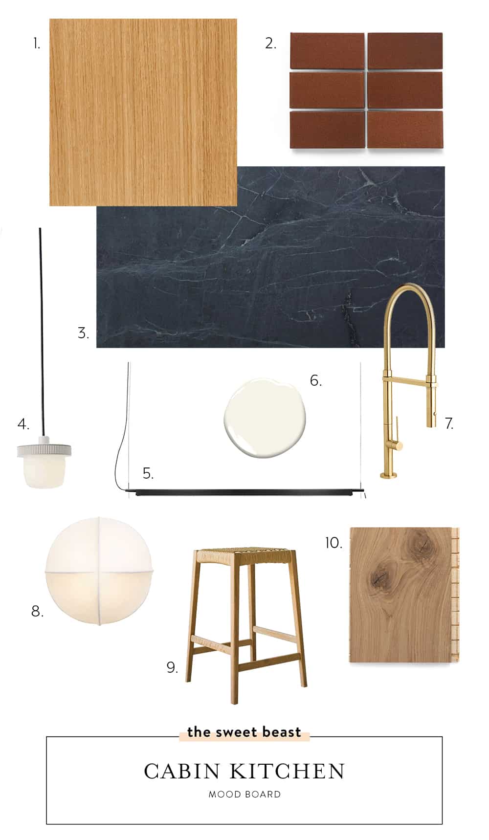
[ 1. Oak Veneer Cabinet Door | 2. Tile | 3. Soapstone | 4. Mini Pendant | 5. Linear Pendant | 6. BM Simply White | 7. Faucet | 8. Accent Sconce | 9. Stool | 10. Stuga Shell Flooring ]
Planning
We’re keeping the original footprint (with a few additions) not only because it’s cheaper but also because I’ve reworked it several times and just keep ending up back here. Without changing several other structural elements, this is the best we can do.
To plan our kitchen, I used 3 different tools:
- SketchUp for the overall plan with precise measurements
- IKEA Kitchen Planner for cabinet planning (and ordering)
- Photoshop for mood boarding
To get started, I collected all the fine measurements (I love my laser measure) for our kitchen and put them in SketchUp. My interior design brain really doesn’t work without SketchUp anymore. I’ve been using it for years which means for me, I can create a new layout idea in SketchUp quicker than I can draw it on paper.
Because we’re using IKEA cabinet boxes, I needed to use their Kitchen Planner tool to map out our preferred boxes and their door and drawer configurations. The IKEA Kitchen Planner was recently updated and is now significantly easier to use – just be sure you’re using Safari and not Chrome as your browser. As our specific cabinet plan got more and more refined, I’d update SketchUp to match so I could see it all together better and be 100% sure it’d all fit.
For mood boarding (in addition to physical samples) and inspiration gathering, I use Photoshop. I can see finishes and textures together best and pull in real photos of specific fixtures, appliances, and more and see how they go together.
Problems to Solve
When we started to get really critical about what changes we needed to make to make ourselves happier in our kitchen, we started with a list of pain points or problems to solve:
- Coffee zone – I am very lucky to have a live-in barista who not only makes me Aeropress coffee every weekday morning but who makes me pour-over on the weekends. Right now, all of his very specific coffee accoutrement is placed on the island.
- Bar zone – Andy is also a talented cocktail maker and really got into trying to make a lot of special drinks over the last few years. We have a lot of bottled ingredients that need a home.
- Traffic jams – The location of the two above items also makes for traffic jams behind the counter; it’s hard to make breakfast while coffee is being made, and difficult to cook dinner when cocktails are being prepped.
- The view from above – our cabin has a loft and it very much bothers me to look down from the loft and see the top of the upper cabinets. It looks unfinished and also provides a home for platters the previous owners left behind that Andy is oddly attached to displaying.
- Pantry – Behind the stove wall is a closet we use to store nearly everything that doesn’t have a home – cleaning supplies, my bins of cabinet door and tile samples, our secret microwave, and all of our food. Every time we need a dry good, we walk out of the kitchen, into the entryway, and into a closet.
- Sink – we’ve got a small, divided sink into which nearly nothing fits. A bigger, single bowl sink has been at the top of Andy’s kitchen wish list since the very beginning.
Cabin Kitchen Before and The Plan
Below you’ll see before images of the cabin followed by matching SketchUp renderings for a sneak peek into the future. The lighting plan and few other things are still being refined, but we’re feeling so good about how things are shaping up.
The Big Kitchen View
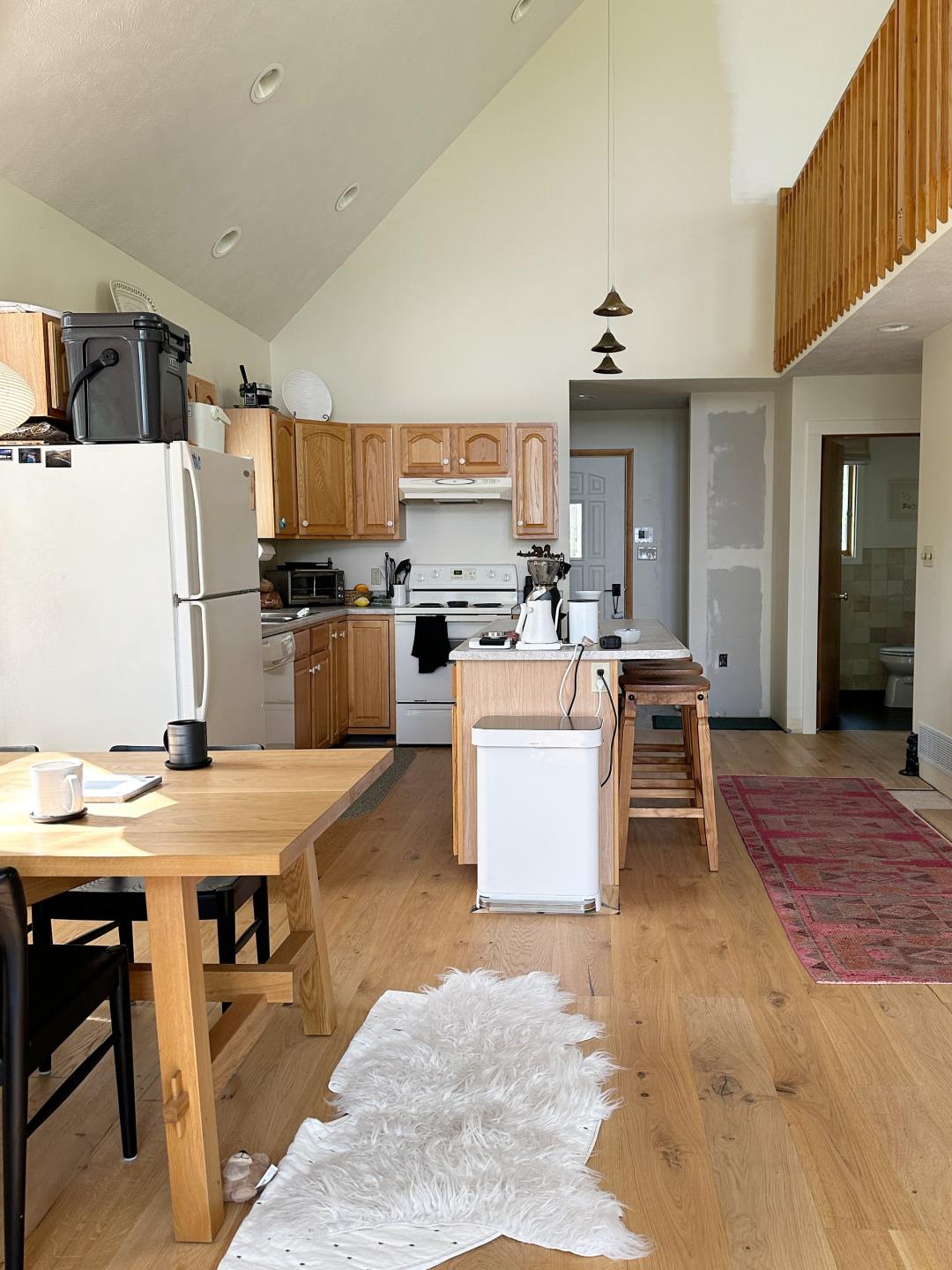
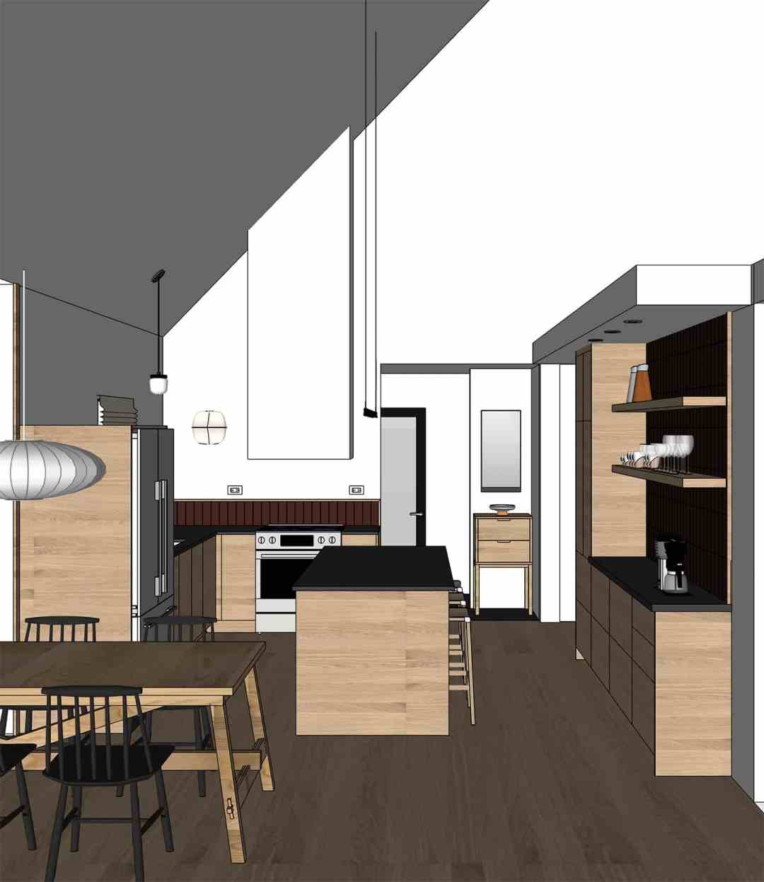
This view of the kitchen is going to go from my least favorite to my most favorite. We’re adding a dramatic range hood that goes all the way to the ceiling. We’re moving garbage into a cabinet so it isn’t a focal point. A simple linear pendant over the island will provide necessary task lighting while remaining minimal to respect the view through the cabin.
The Overhead View
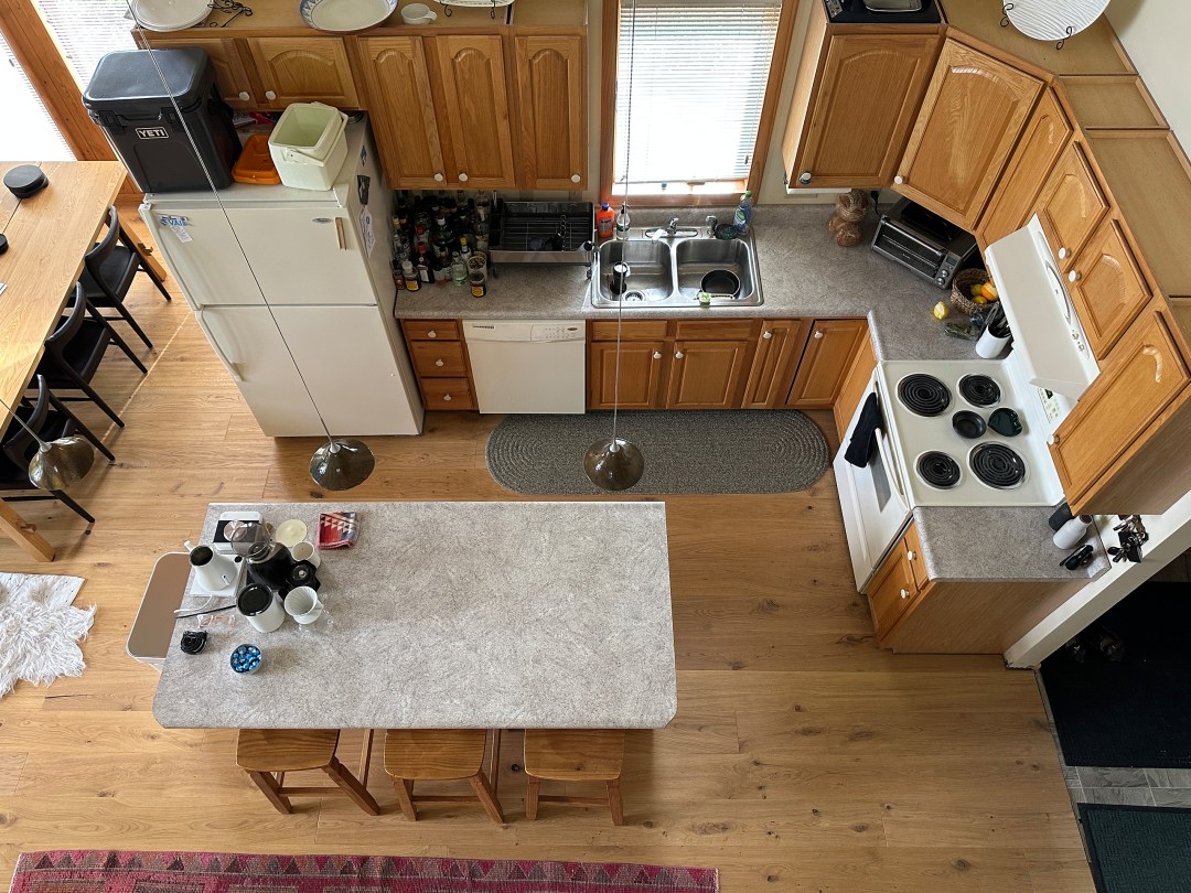
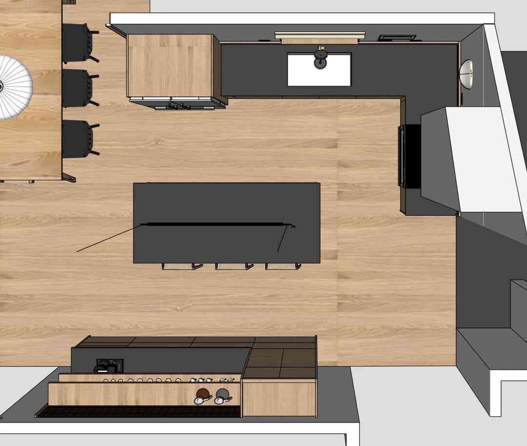
We’re keeping the original layout but adding 15” deep cabinets behind the counter stools to create a coffee and bar zone. This pulls the countertop clutter into a dedicated space, adds a working surface, and gives us additional storage.
We chose a counter depth refrigerator and will wrap it in cover panels for a built-in look. The current fridge has big, full width doors that mean the fridge is only accessible from one side while blocking the work zone. Our new fridge will have french doors on top and a pull out freezer on the bottom.
The Sink View
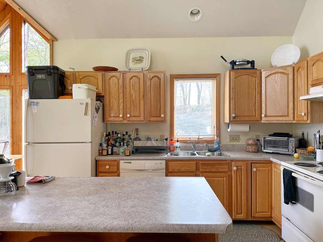
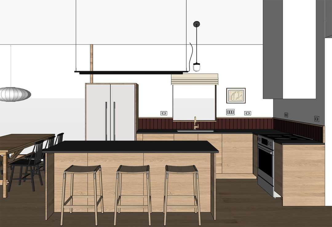
A big, likely controversial, change we’re making is opting for no upper cabinets or shelving in the main work zone of the kitchen. We thought carefully about the way we use this kitchen and accessibility. I am a shorter person and upper cabinets are largely useless to me. We are creating storage that is more efficiently used and I do not think we will miss the uppers. And if we do, we can always add on in the future.
A single row of earth toned, matte tile will form a minimal backsplash, wrapped in an oak edge. We’ll need to move the receptacles up to avoid placing outlets on the tile, and we’ll rotate the outlets for a more minimal feel.
Adding a larger sink and a more robust corner cabinet to the plan meant the sink landed off center with the existing window. We decided to solve this and bring in more natural light by adding a wider window. We’re also slightly increasing the length of the island, giving us a roomier seating area and increasing storage to allow us to move garbage and recycling inside a pullout cabinet.
The Coffee and Bar Zone
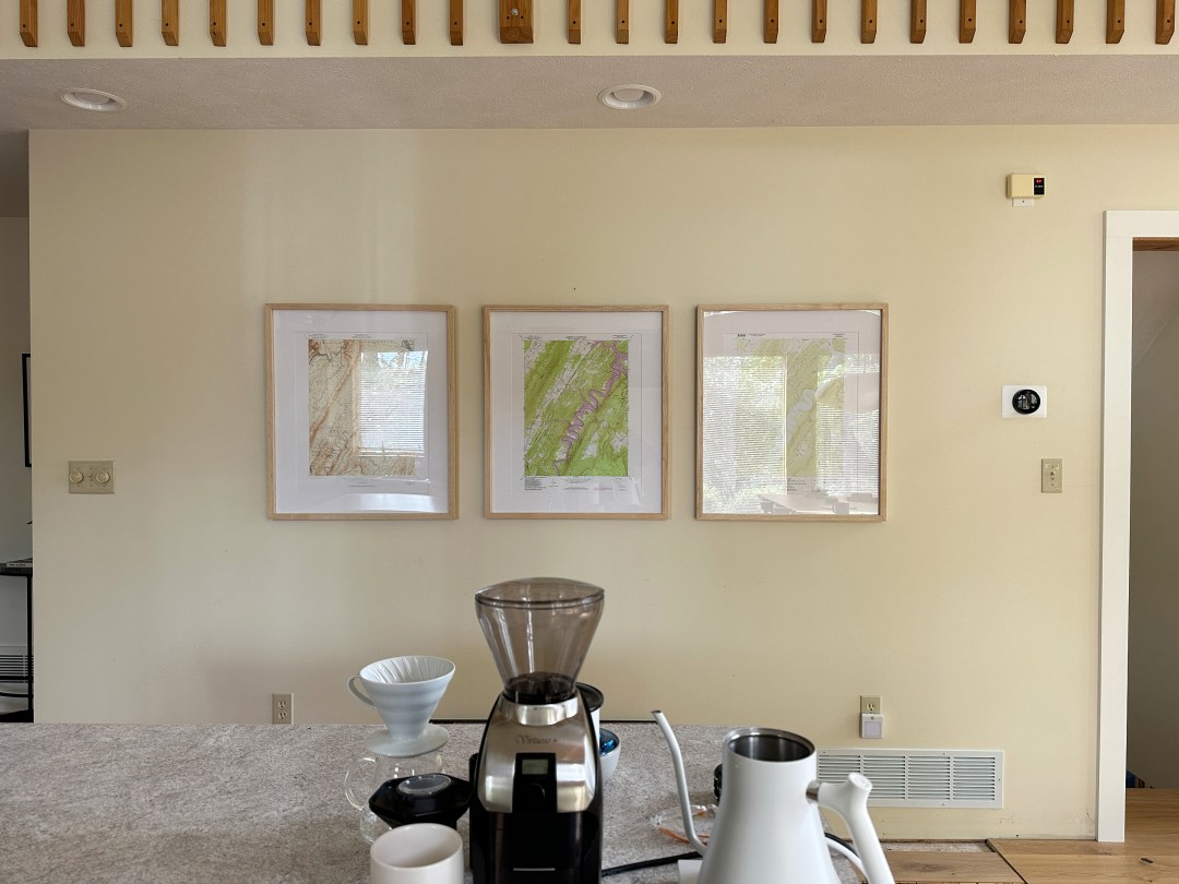
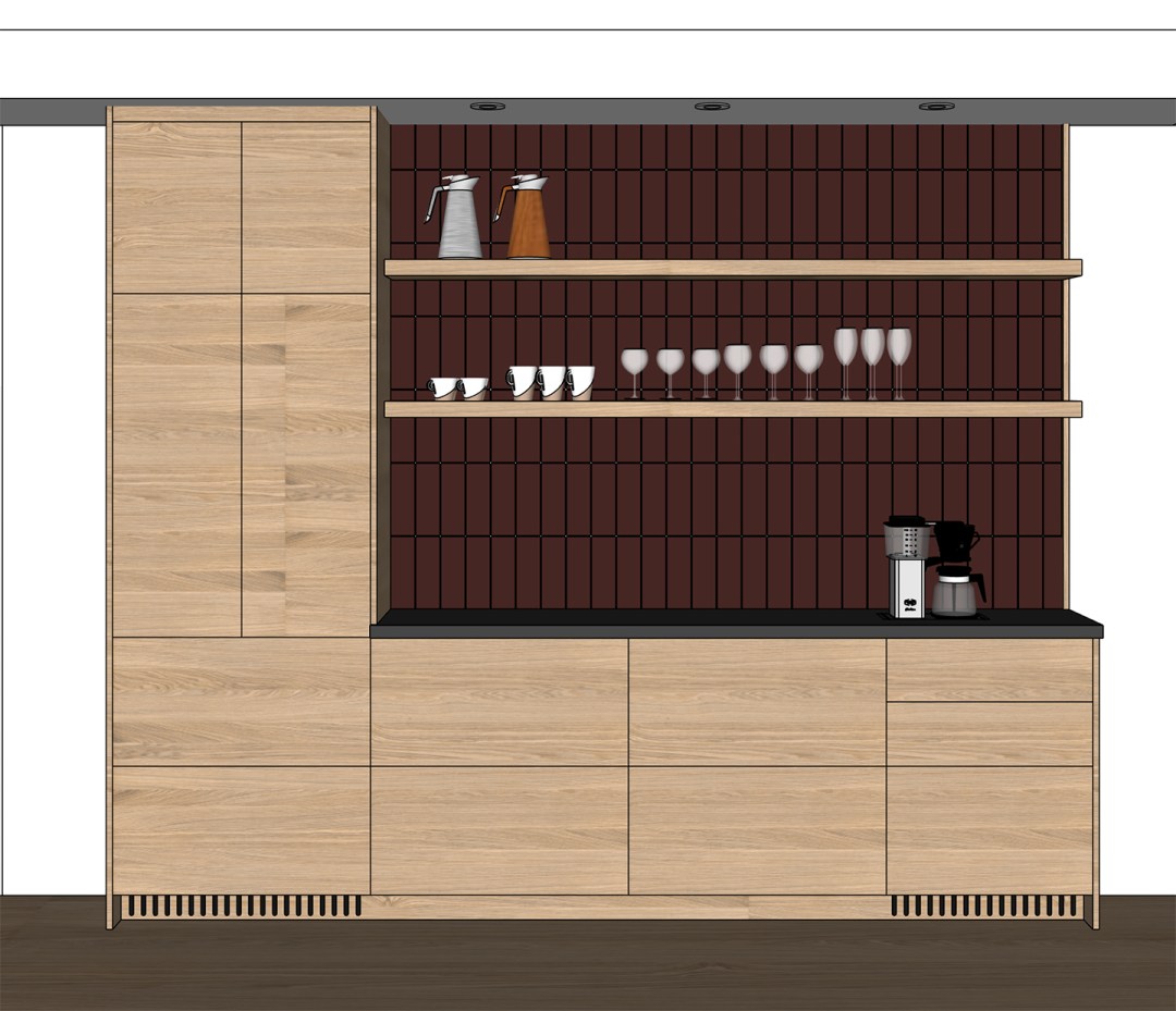
The biggest modification to the footprint is the addition of the coffee and bar area. This new area adds additional closed storage with a high cabinet on the left to house our pantry goods and microwave. It also provides extra counter space for prepping coffee and mixing cocktails. The drawers below will house coffee and bar supplies as well as lesser used serving pieces. We’ll add open shelves to display our best drink ware against a tile backsplash.
What’s Next?
Kitchen renovations take a lot of time. There’s endless planning, sample ordering and comparing, and detail after detail to figure out. We’ll be juggling a lot of different timelines and will be doing 90% of the work ourselves (with my dad), so this will be a long project that will take us through the summer. I’m looking forward to bringing you along on our progress over stories, and sharing more concrete plans and knowledge sharing here on the blog. Our next biggest decision to make is finalizing our IKEA cabinet door selection. I’ve ordered every oak sample out there and I’m going to tell you all about it in my next post.



7 Comments
This is a fabulous plan & it’s going to be stunning. Of all the changes that you mentioned the one that I can’t wait to see is the tile being wrapped with a wood trim.
I’ve never seen that before & I’m excited to see the finished backsplash.
Mary! Thank you. You are always so thoughtful and kind. I’m really excited to see the oak and tile together, it’ll be suck a minimal but special, unexpected touch!
Love this!!
I love this vision! Can’t wait to see it become a reality.
Thank you, Kathleen! I couldn’t be more excited to start working on it and see it come together after being in my brain for so long!
Love all the details you shared. Excited to follow along with this transformation!
Thanks so much, Lucinda! I am so excited to get into it!